Inspiration:
I really liked how the title was offset on the left and everything was in a pretty tidy column on the right.
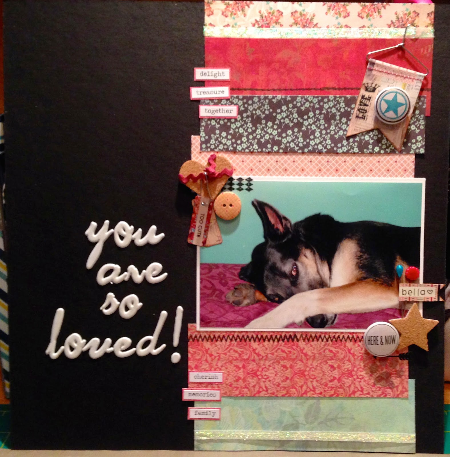
Here is my interpretation:
The patterned paper is from Basic Grey's Lucille line. The title is letter Thickers. The
em-bellie-shments (*snort) are from Lucille, Studio Calico, and some unknown buttons (called flare in the craft world). The word stickers are by Tim Holtz, as well as the rub-ons and stamps. I also used some sparkly ribbon I had in my stash.
In the original layout, I though the colours in the photo matched too closely to the patterned paper and got lost a little. I "fixed" that by using black as the background and using paper with lighter tones than the picture. I want the eye to go to the pic first and then to the title. I'm not a designer, but I always think the picture should pop out first.


Coy Bella!
ReplyDelete