Friday, August 29, 2014

Self-imposed Summer Challenge

Tags…Tim's Tags…a quick (some what) and small "canvas" to try out different techniques without fear of wasting expensive products.  Tim posts a new one every month but my school year is just too busy to keep up.  So, I challenged myself to create 20 different tags this summer using 20 different techniques.  My peep thought I was NUTS and was putting too much pressure on myself but it seems do-able at the end of June when I told her about my plan.  Well…much to my surprise, I managed to complete 40 (yes FORTY!) tags as of today, the last day of summer vacation!!  (Actually I have two bases drying, so really I almost completed 42!).

At first I was puzzled with what the heck I was going to do with all these tags.  I am a big picture kind of girl.  I need to see where I am going before I can start the journey.  (Hence why I had to prep the entire economics course this summer before teaching the first lesson next week!)  I thought of maybe making an album for tags, but quickly realized the thickness of the embellishments was going to make that task near impossible.  Then I considered some sort of pocket wall storage but abandoned that when I realized that no one would ever see it unless I hung it in my driveway!  And, so my faithful reader (Cindy?), this blog is going to serve as my vessel for displaying my tags!


My purpose of creating tags was to work on my background techniques - how to create dimension, layers, depth, etc.   Here is the first one I am revealing (and actually the last of the 40):


I just realized that my inspiration of this tag was made for Tim's August 2014 Challenge, so by complete accident, I did a Tim tag on time!!

Here is Tim's original:

And here is the one that caught my eye on Pinterest which came from this blog:


Not having a clue that I was actually doing Tim's tag, I didn't consult his blog for the technique. I decided just to experiment with layering distress paints, stains, and inks.  Here is the background before I embellished it:

This was three layers.  For the first, I used Broken China and Wild Honey paints, misted with water. The second was Antique Bronze & Tarnished Brass paints.  The third was a little Picket Fence stain and paint & Walnut Stain stain (that was weird to type). I dried each layer with a heat gun before applying the next layer.
I really liked how to eye stamp stood out on my inspiration tag, so I first stamped the eye and the three men (I love moustache man), the eye chart and the quote.  They all were equally dark, so once the ink dried, I sanded the men and eye chart to dull them a little.  The stamps came from two Tim sets: City Central & Curious Possibilities.
For embellishments, I used: Swivel Clasp, Mini Gears, Crinkle Ribbon dyed with Mustard Seed and Tea Stain ink, a piece of film strip, and a Metal Custom Fastener.

The other thing I really liked from my inspiration tag were the stars in the top right corner.  I mimicked them by using the Memory Box Stars Starry Nights template and some embossing paste at the top and Ferro Gold paste on the bottom:


The very last thing I added (because the empty space seems weird) was the pen nib under the quote.  It's part of a pen nib stamp that I had previously stamped on a piece of transparency and used on another project.

I added one more element to the tag after I thought I was finished.  Here is the picture before I added it. Can you figure out what I did?

Monday, August 25, 2014

Those eyes….

It was my intention to take better photos of my projects before posting another blog entry, but I came home to rain in Winnipeg yesterday and it's still going.  I think taking pics outside in the sun will make the project looks better for you, the viewers at home.  So, alas, you will all  have to wait until the sun decides to reappear. I actually don't mind the rain as it was getting really dry here and my lawn was cracking.  At least the rain is feeding my weed garden.

Here is another layout from Sassy's album.
The picture of Sassy is much lighter in real life; you'll just have to imagine it for now.  The title is also not crooked.

This is my inspiration, a layout by maniscrap that I found on Pinterest:
I was drawn to the dots on the page.  I've been really into using stencils since Tim Holt's workshop in Ohio.  In this case,  I liked how the dots led the reader's eye across the page to the picture.  Sadly, I just now noticed the larger dots matting the picture and embellishments.  At first I was a little sad that I didn't copy those as well, but I only have a dot stencil in one size, so perhaps it was fate that I didn't even see them til now.

I decided to reverse the layout as it looked funny when Sassy was looking off the page when I first put the picture on the right, like in the original.  So I moved her to the left and I like the way it looked better.  I also didn't want all the various embellishments in the original, so I stuck to stamped circles from this Simon Says Stamp set.  I coloured stamped the inside with Tim Holtz Distress Ink and then misted water on it to give it a modelled look.  When they were dry, I stamped the online with Versamark black ink.  I really like the colour combination of Worn Lipstick, Mustard Seed, Bundled Sage, and Tumbled Glass.  To bring those colours into other places on the layout, I used the ink to colour the piece of card stock behind the title, to make the dots, and I chose title stickers that matched as well.
To finish all the layout, I added the following: Tim Holtz word band & enamelled plaque, pink and white twine, some jewels, paper scraps, and a heart brad.

Friday, August 22, 2014

Sassafrass - my lass!

I had a great Facebook conversation with my good friend Cindy (Momma C) about the colour of the tag on the last layout I posted.   At her suggestion, I am going to ink the tag with the same colour pink (Worn Lipstick) that I used on the star circle.  I love getting other artsy people's opinions as sometimes it is is hard to see things about your own work when you have stared at it for so long.  So feel free to comment and suggest how I can improve things!

To change things up, I'm going to post the title layout in the album I just started for Sassy.

My inspiration came from this unknown layout:

Most people have really eventful lives and have to cram as many photos on their layouts as they can, so it is often hard to find good layout with one only photo.  So when I come across inspiring ones, I take screenshots and file them away.  If the world truly is small and this happens to be your layout, please let me know and I will give you all the credit!

What drew me to the inspiration layout was the use of white spare.  I like the photo being in the bottom right corner with the folded over top corner to balance it out.  I knew I wanted to keep that aspect, but I inked a piece of white cardstock with teal ink and put it behind to keep the page square.   
The day I made this layout, I had just received an online order of crafty goodness and I really wanted to use this paper from Farmhouse Paper Company. I love the combination of teal and yellow.  In order to use more than one or two patterns, I added the strips of paper at the bottom of the layout.   
The big butterfly wasn't doing it for me, but I found the two grungeboard stars in my stash and inked them with Peacock Feathers and Mustard Seed.  I used the leftover ink that was on my craft mat to die the crinkle ribbon that I put around the tag behind the picture.
I used a few metallic paints to colour the title plate and used the left over to dye the tag.  The photo doesn't do a great job of showing the match of the tag to the title plate; it is much better in real life.
After placing all the embellishments and other pieces, I felt the left side of the photo to be too open, so I wrote the journalling there, instead of on top of the photo like in the inspiration layout.
It was late at night when I finished.  I came back to the layout the next morning and the white space was, well, too white.  I wasn't happy with it, so I took the Peacock Feathers Ink, added some water, and then flicked it across the page.  This seemed to be the trick as it brings the person's eye towards the photo.  

Here are the supplies used in this layout:
Farmhouse Paper 302 BTW
Tim Holtz distress inks in Peacock Feathers, Mustard Seed, Brushed Corduroy
Tim Holtz distress paints in Picket Fence, Antique Bronze, Tarnished Brass
Tim Holtz rubons, ephemera, crinkle ribbon, grungeboard elements, mini paperclips, wire pin, philosophy tag
Memory box stencils
Various brads from my stash

Thursday, August 21, 2014

Learn from my mistakes!


Here is another layout from Bella's album.  I have had the star chipboard circle for years and finally decided it was time to use it.  I coloured it with Tim Holtz's ink using the following colours: mustard seed, worn lipstick, peacock feathers, wild honey, and broken china.  Now here is one of those "learn from my mistakes" moments…I wanted to coat the chipboard with distress crackle rock candy paint, however you must wait for the ink to dry before smearing on the paint or the ink smears.  Ultimately the result was ok, but I would have liked for the ink to be sharper.
Other supplies include: Tim holtz clock and film strip stamps, card stock scraps, title & journalling card from My Mind's Eye, big gem brads, My Favourite Things dot stencil coloured with Pumice Stone ink.
If I was going to redo the layout, I would have used a different coloured journalling tag as I don't think the light pink goes well with the other colours.  Oh well, live and learn!

ADDED: I forgot to mention that I designed this layout all by myself!

Monday, August 18, 2014

Is-a-Bella cute? Yes she is!

Tonight I'm sharing another layout from Bella's album.  I wish I knew exactly who to give the credit to, but awhile ago I was browsing various sites and just took screen shots of layouts that I liked.  This one was from a now defunct website called Two Peas in a Bucket.  The URL at the top says it's by member "~ekskou" so if that's you, please leave a comment with your name as I like to give proper credit.

Inspiration:
I really liked how the title was offset on the left and everything was in a pretty tidy column on the right.


Here is my interpretation:
The patterned paper is from Basic Grey's Lucille line.  The title is letter Thickers.  The 
em-bellie-shments (*snort) are from Lucille, Studio Calico, and some unknown buttons (called flare in the craft world).  The word stickers are by Tim Holtz, as well as the rub-ons and stamps.  I also used some sparkly ribbon I had in my stash.
In the original layout, I though the colours in the photo matched too closely to the patterned paper and got lost a little.  I "fixed" that by using black as the background and using paper with lighter tones than the picture.  I want the eye to go to the pic first and then to the title.  I'm not a designer, but I always think the picture should pop out first.

Sunday, August 17, 2014

My Bellie

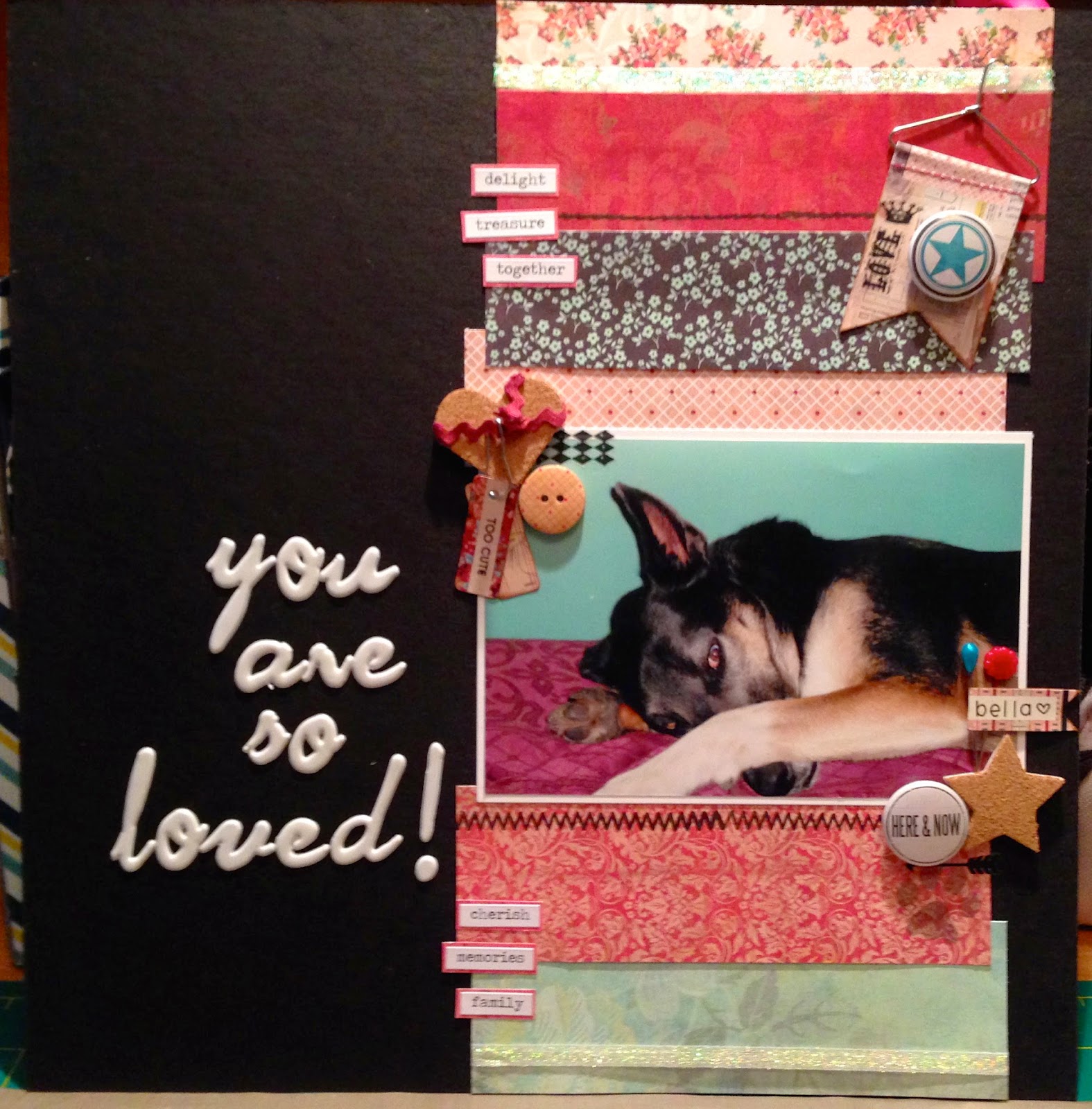
One of the things I accomplished this summer was (finally) making a 12x12 album of Bella.  I've done a few mini albums of her over the years, but I had moved away from 12x12 scrapbooking.  I have no idea what prompted me to move back, but as I was sorting pictures I had tossed into a giant box, I found lots of cute ones of her that I wanted to scrap.

As I explained in my first post, I do not consider myself to be an artist, but rather a good copier of fabulously creative people.  In the crafty world, this is called scraplifting.  Not ashamed.

I found this layout on Pinterest:
and was inspired by the white paint in the background.  This layout was created by Ulrika Wandler Here is a link to her blog, which I think is in Swedish) and was originally posted on the Bo Bunny blog.

Here is my interpretation:


I used Tim Holtz stain in Bundled Sage and Victorian Velvet instead of white paint. I also used some odds and ends scraps that I had, along with some washi tape and letter Thickers. The graph stamp in the two corners was reclaimed from my desk at work, from years past when I would stamp the coordinate plane for the kids to graph on.  While it is the title in Ulrika's layout that first catches me eye, I wanted the picture of Bella to pop out first.  Was I successful?

Tim Holtz: O Captain, my Captain!

I was very fortunate to attend a fantastic art/paper craft workshop in Ohio earlier this year put on by one of my favourite online stores Simon Says Stamp.

My peep convinced me to go and I am so happy she did!
(airport selfie)
(We might have the same tastes.)

 The featured teacher was the adorably cute, effervescent, one and only Tim Holtz.

(Me, Tim, and a new crazy friend Diana)

To be able to take one class from Tim is a blessing; we took three over the course of two days.  Prior to this event, I owned a few tim Holtz products, but really didn't understand how to use them or why they were special (Sorry Tim!).  Well…his classes opened my eyes to the world of inks, stains, paints, blending colour, abstract randomness, getting messy, and loving it!  (A few of you know my obsession of keeping my fingers clean, especially when eating movie theatre popcorn.  I use about 20 napkins for a small!)

The first class was 4 hours long and overwhelming.  I think I started to hyperventilate at one point.  He was moving so fast and so many of the techniques were new.  I'm still not done the final project, but here is the beginning of the Folio album:


The second class was this cute little burlap canvas:
Can you believe I MADE that??

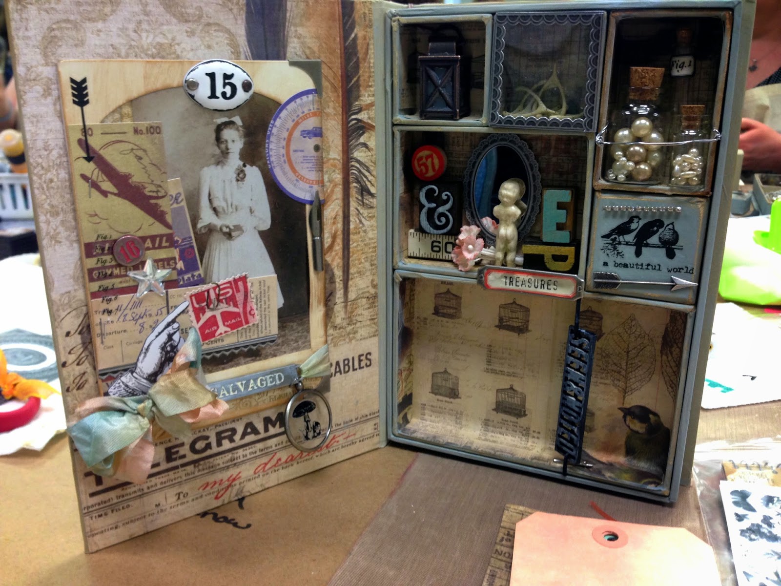
And the last class was this amazing configuration box with a working miniature lantern in the top left corner!
Before attending this workshop, I had sadly lost my scrappy mojo.  Real life got in the way, with deadlines, projects, assignments, three jobs, and my peep's move to Toronto.  I was so happy to come home from Ohio with a ton of goodies and an inspired zest for creating!  I have been crafting up a storm since there, which I will share with you in upcoming posts.  Stay tuned!
(My haul!  And all I took was a carry on!)

~E

Friday, August 15, 2014

Closet Crafter

My name is Ellen and I am a closet crafter!
It's true.
Most people probably don't know I am crafty.  
I teach high school math.
I am concrete sequential, an ESTJ, and off-the-chart left brained.

Looking at the picture above, I think my coworkers and acquaintances would agree I am on the left.  But there is a whole other side of me that most people don't get to see.  I like colour.  I like being creative.  I am passionate about things that interest me.  My other teaching major was…*gasp*…a language!  Even as a little girl, I remember the joy and excitement I would get upon seeing construction paper, macaroni, glue, and some paint.  Pompoms made me happy.  Pipe cleaners, don't even go there! Scrap fabric and my mom's pinking shears would result in my own Project runway creation at 6 years old.  
Over the years, my crafting has ebbed and flowed as life as an adult took precedence.  I've done cross stitch, needlepoint, blackwork, felting, etc.  In 2004, during a particularly uneventful spring break, I found card making.  Oh the paper, the pretty paper!  The world of paper crafting unfolded before me and I was hooked.  Over the last 10 years, I have made countless scrapbook pages, mini albums, mixed media projects, cards, et al.  Most of these projects have been for me and I've learned over the years that it is more about the process - learning new things, having a creative outlet, stress relief - than about the finished product.  Not having children, I'm not preserving memories for a future generation.  Being an educator comes with a natural passion for learning.  I craft to learn and grow as a person.

Why blog? Why now?
While my brain does dabble on the right side quite often, I would never call myself an artist.  Artists, to me, see the world differently than I do.  They see colour in black and white.  They get inspired from nature.  They can turn a block of wood, stone, clay, junk into something unique and beautiful.  They look at a square and see a circle or rectangle or box or…  I see a square.  
So…how do I create?  I get inspiration from artists.  I am a great copier.  I can take their circle square and tweak it.  Yes folks, I am a craft-lifter!  I scan the internet and Pinterest (Follow me!) and look for projects that say "Hey you!" to me.  I am not sorry or ashamed.
And so, this blog was born to give back to the crafty community and share some of my creations in the hope to inspire others.  When possible, I will show my project along with the inspiration to give credit where due.  I hope you enjoy the journey.

~E