Hello crafty world!
I *may* have received my order from Joann's today!! Let me tell you my Canadian peeps, Joann's is definitely the best place to order crafty supplies from! Wait for a sale on your favourite products - their sales are frequent. Combined that with a 20% off your entire order coupon, and even with the shipping and duty, the prices are lower than anywhere local. Their variety of products is HUGE, with many things we cannot get here. (Teacher peeps - you can get 15% off every day if you sign up on their website.)
In my order was a few new distress inks and stains. I had so much fun tonight creating my own colour charge for all the distress inks I own (don't judge me!):
Aren't some of the names of the colours awesome??
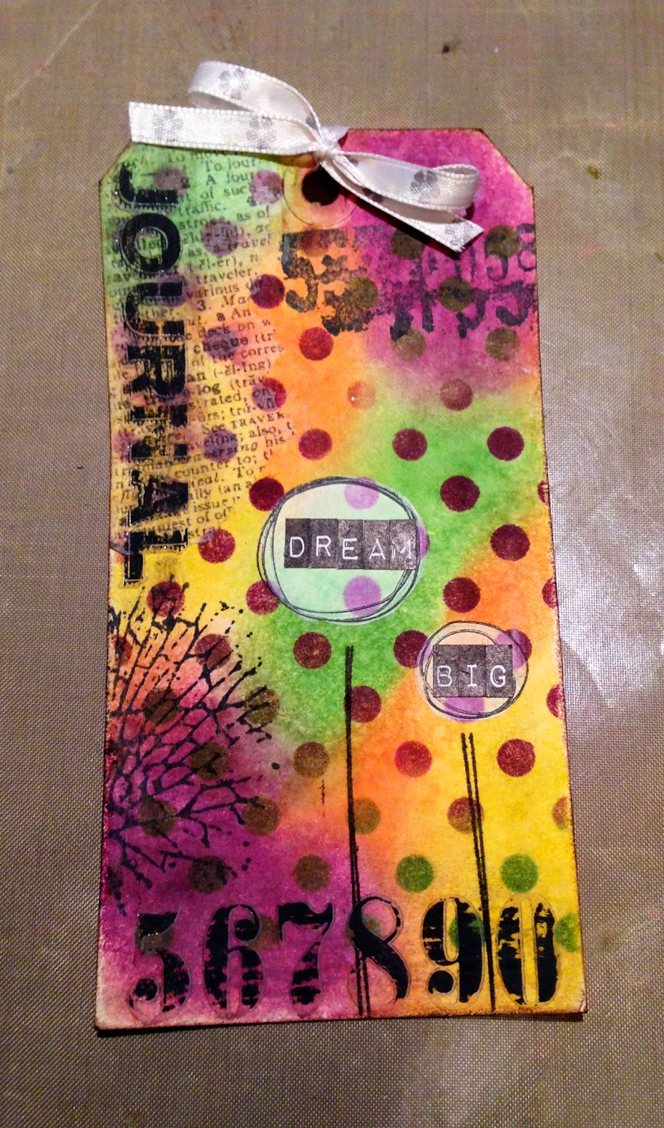
I didn't have that much time tonight (hello real world of responsibilities!) but I needed to try out my new distress stains as they were calling to me from the mailbox. I put together this quick tag but mixed peacock feathers & silver stain and then added a little spiced marmalade ink afterwards. I LOVE the effect and will definitely need to play around more in the near future.
Math teacher by day, student by night, crafter when I can: It's time to give back for all the inspiration & ideas galore I've stolen from others.
Tuesday, September 9, 2014
Sunday, September 7, 2014
Tags, tags, and more tags
Hello!
I'm here to share three more of the My Self Imposed Summer Tag Challenge.
I cannot for the life of my find the inspiration for this first one. I know I didn't come up with it myself because I clearly remember trying to duplicate the blue background with the embossed stamping. If the original was yours, please let me know!
The second tag was inspired by the lovely and very very talented France Papillon. Her tag was made from a napkin that she glued as a background. I loved the colour blocking, but obviously didn't have the napkin, so I attempted to recreate the same effect with distress markers.
Here is the napkin tag:
and here is mine:
It was really fun to use markers and water brushes to try to get the same shadowing and colour variations.
The third tag was inspired by one that I found on Pinterest, from this blog. I liked the industrialness (I'm sure I just made up that word) of the design.
Stay tuned for more on my summer challenge tags!
~E
I'm here to share three more of the My Self Imposed Summer Tag Challenge.
I cannot for the life of my find the inspiration for this first one. I know I didn't come up with it myself because I clearly remember trying to duplicate the blue background with the embossed stamping. If the original was yours, please let me know!
The second tag was inspired by the lovely and very very talented France Papillon. Her tag was made from a napkin that she glued as a background. I loved the colour blocking, but obviously didn't have the napkin, so I attempted to recreate the same effect with distress markers.
Here is the napkin tag:
and here is mine:
It was really fun to use markers and water brushes to try to get the same shadowing and colour variations.
The third tag was inspired by one that I found on Pinterest, from this blog. I liked the industrialness (I'm sure I just made up that word) of the design.
Stay tuned for more on my summer challenge tags!
~E
Monday, September 1, 2014
Tim's September Challenge!!
I did it! I did it! This is the first time ever that I have a) completed Tim's challenge in the current month and b) completed it on the first day of the month!! It must be the very last day before heading back to school!
Click here to see Tim's Creation. Mine is below:
Some things I did different than Tim:
- I don't own alcohol inks (not good for someone with an allergy to alcohol) so I used distress inks instead. Colours: Spiced Marmalade, Salty Ocean, Seedless Preserves, Festive Berries, Picked Raspberry, Peacock Feathers, Mustard Seed, and Moved Lawn.
- I wanted one word to stand out at the bottom, so instead of using a rub-on, I used a word sticker and coloured it with my water brush and Picked Raspberry ink. I also put one of the butterflies here.
- I realized after that I should have cut the butterflies from glossy cardstock, not watercolour paper. I like how Tim's butterflies have a shiny look to them. I spritzed the top of my tag with glimmer spray to make it shimmer.
- Instead of the Schoolhouse stencil, I used Harlequin. First with Antique Linen, then I covered that layer with the stencil and used Iced Spruce in the negative space. You can best see this technique in the face stamp.
- I stuck with a manilla tag instead of Tim's fancy black one, so I inked the edges with Peacock Feathers.
Click here to see Tim's Creation. Mine is below:
Some things I did different than Tim:
- I don't own alcohol inks (not good for someone with an allergy to alcohol) so I used distress inks instead. Colours: Spiced Marmalade, Salty Ocean, Seedless Preserves, Festive Berries, Picked Raspberry, Peacock Feathers, Mustard Seed, and Moved Lawn.
- I wanted one word to stand out at the bottom, so instead of using a rub-on, I used a word sticker and coloured it with my water brush and Picked Raspberry ink. I also put one of the butterflies here.
- I realized after that I should have cut the butterflies from glossy cardstock, not watercolour paper. I like how Tim's butterflies have a shiny look to them. I spritzed the top of my tag with glimmer spray to make it shimmer.
- Instead of the Schoolhouse stencil, I used Harlequin. First with Antique Linen, then I covered that layer with the stencil and used Iced Spruce in the negative space. You can best see this technique in the face stamp.
- I stuck with a manilla tag instead of Tim's fancy black one, so I inked the edges with Peacock Feathers.
Tag time!
Hello fond reader!
I am going to share 3 tags today. They all use the same background technique, but because of the different colours and embellishments, they all look totally different in the end.
The technique is not very complex, it is simply applying different colours of distress ink to a tag using the Mini Blending Tool and then spritzing it with water to make the colours bleed into each other.
This was actually the very first tag I made for my Self-imposed summer tag challenge. This one came completely from my own head. No thievery involved!
Inks were Picked Raspberry, Salty Ocean, Spiced Marmalade, and Mustard Seed. (I just realized that I use Mustard Seed a lot!). I wanted the texturing to go from dark at the bottom to light on the top, so I started that the same old polka dot stencil stamped in Pumice Stone with clear embossing Powder on top. Above the quote (Another TH Stamp), I used his honeycomb stamp with Scattered Straw Ink and gold detailed embossing power on top. The very top is the TH Rays stencil with glitter embossing powder. Why the elephant? Why not!
Which tag do you like the best?
I am going to share 3 tags today. They all use the same background technique, but because of the different colours and embellishments, they all look totally different in the end.
The technique is not very complex, it is simply applying different colours of distress ink to a tag using the Mini Blending Tool and then spritzing it with water to make the colours bleed into each other.
This was actually the very first tag I made for my Self-imposed summer tag challenge. This one came completely from my own head. No thievery involved!
For inks, I used salty ocean, peacock feathers, mustard seed, wild honey, and picked raspberry.
To finish the background, I stamped with a script stamp in copper, used a Memory Box polka dot stamps with wild honey ink, and the stain marks using the Hero Arts Not Perfect stamp set.
I wanted the face stamp (from Tim's Daydream set) to look like it was sitting on top, so I stamped in on a clear name tag holding that was sitting on my table from a recent conference. Once dried, I cut it out and stapled it on
Other embellies include: metal clock from Michaels, tag from my stash striped wash tape, Websters ribbon, and a TH quote stamp.
Tag #2 was a complete steal from Pinterest, which came from this this lovely lady's blog.
I had trouble getting the flowers as dense white as she had them. In hindsight, I probably should have used white paint, but instead I used Close to my Heart white ink, stamped 3 times, drying the layers in between. For the background, I used ink in Mustard Seed, Mowed Lawn, Spiced Marmalade, and Seedless Preserves. I used the same polka for stencil. Other items used were TH Grunge stamps, SimonSayStamps Scribbly Circles stamps, ribbon from my stash, and TH Remnant Rubs.
The third and last tag for today was kind of a steal. I liked the four colour background on this tag, so I borrowed that.
Which tag do you like the best?
Friday, August 29, 2014
Self-imposed Summer Challenge
Tags…Tim's Tags…a quick (some what) and small "canvas" to try out different techniques without fear of wasting expensive products. Tim posts a new one every month but my school year is just too busy to keep up. So, I challenged myself to create 20 different tags this summer using 20 different techniques. My peep thought I was NUTS and was putting too much pressure on myself but it seems do-able at the end of June when I told her about my plan. Well…much to my surprise, I managed to complete 40 (yes FORTY!) tags as of today, the last day of summer vacation!! (Actually I have two bases drying, so really I almost completed 42!).
At first I was puzzled with what the heck I was going to do with all these tags. I am a big picture kind of girl. I need to see where I am going before I can start the journey. (Hence why I had to prep the entire economics course this summer before teaching the first lesson next week!) I thought of maybe making an album for tags, but quickly realized the thickness of the embellishments was going to make that task near impossible. Then I considered some sort of pocket wall storage but abandoned that when I realized that no one would ever see it unless I hung it in my driveway! And, so my faithful reader (Cindy?), this blog is going to serve as my vessel for displaying my tags!
My purpose of creating tags was to work on my background techniques - how to create dimension, layers, depth, etc. Here is the first one I am revealing (and actually the last of the 40):
I just realized that my inspiration of this tag was made for Tim's August 2014 Challenge, so by complete accident, I did a Tim tag on time!!
Here is Tim's original:
And here is the one that caught my eye on Pinterest which came from this blog:
Not having a clue that I was actually doing Tim's tag, I didn't consult his blog for the technique. I decided just to experiment with layering distress paints, stains, and inks. Here is the background before I embellished it:
This was three layers. For the first, I used Broken China and Wild Honey paints, misted with water. The second was Antique Bronze & Tarnished Brass paints. The third was a little Picket Fence stain and paint & Walnut Stain stain (that was weird to type). I dried each layer with a heat gun before applying the next layer.
I really liked how to eye stamp stood out on my inspiration tag, so I first stamped the eye and the three men (I love moustache man), the eye chart and the quote. They all were equally dark, so once the ink dried, I sanded the men and eye chart to dull them a little. The stamps came from two Tim sets: City Central & Curious Possibilities.
For embellishments, I used: Swivel Clasp, Mini Gears, Crinkle Ribbon dyed with Mustard Seed and Tea Stain ink, a piece of film strip, and a Metal Custom Fastener.
The other thing I really liked from my inspiration tag were the stars in the top right corner. I mimicked them by using the Memory Box Stars Starry Nights template and some embossing paste at the top and Ferro Gold paste on the bottom:
The very last thing I added (because the empty space seems weird) was the pen nib under the quote. It's part of a pen nib stamp that I had previously stamped on a piece of transparency and used on another project.
I added one more element to the tag after I thought I was finished. Here is the picture before I added it. Can you figure out what I did?
At first I was puzzled with what the heck I was going to do with all these tags. I am a big picture kind of girl. I need to see where I am going before I can start the journey. (Hence why I had to prep the entire economics course this summer before teaching the first lesson next week!) I thought of maybe making an album for tags, but quickly realized the thickness of the embellishments was going to make that task near impossible. Then I considered some sort of pocket wall storage but abandoned that when I realized that no one would ever see it unless I hung it in my driveway! And, so my faithful reader (Cindy?), this blog is going to serve as my vessel for displaying my tags!
My purpose of creating tags was to work on my background techniques - how to create dimension, layers, depth, etc. Here is the first one I am revealing (and actually the last of the 40):
I just realized that my inspiration of this tag was made for Tim's August 2014 Challenge, so by complete accident, I did a Tim tag on time!!
Here is Tim's original:
And here is the one that caught my eye on Pinterest which came from this blog:
Not having a clue that I was actually doing Tim's tag, I didn't consult his blog for the technique. I decided just to experiment with layering distress paints, stains, and inks. Here is the background before I embellished it:
This was three layers. For the first, I used Broken China and Wild Honey paints, misted with water. The second was Antique Bronze & Tarnished Brass paints. The third was a little Picket Fence stain and paint & Walnut Stain stain (that was weird to type). I dried each layer with a heat gun before applying the next layer.
I really liked how to eye stamp stood out on my inspiration tag, so I first stamped the eye and the three men (I love moustache man), the eye chart and the quote. They all were equally dark, so once the ink dried, I sanded the men and eye chart to dull them a little. The stamps came from two Tim sets: City Central & Curious Possibilities.
For embellishments, I used: Swivel Clasp, Mini Gears, Crinkle Ribbon dyed with Mustard Seed and Tea Stain ink, a piece of film strip, and a Metal Custom Fastener.
The other thing I really liked from my inspiration tag were the stars in the top right corner. I mimicked them by using the Memory Box Stars Starry Nights template and some embossing paste at the top and Ferro Gold paste on the bottom:
The very last thing I added (because the empty space seems weird) was the pen nib under the quote. It's part of a pen nib stamp that I had previously stamped on a piece of transparency and used on another project.
I added one more element to the tag after I thought I was finished. Here is the picture before I added it. Can you figure out what I did?
Monday, August 25, 2014
Those eyes….
It was my intention to take better photos of my projects before posting another blog entry, but I came home to rain in Winnipeg yesterday and it's still going. I think taking pics outside in the sun will make the project looks better for you, the viewers at home. So, alas, you will all have to wait until the sun decides to reappear. I actually don't mind the rain as it was getting really dry here and my lawn was cracking. At least the rain is feeding my weed garden.
Here is another layout from Sassy's album.
The picture of Sassy is much lighter in real life; you'll just have to imagine it for now. The title is also not crooked.
This is my inspiration, a layout by maniscrap that I found on Pinterest:
I was drawn to the dots on the page. I've been really into using stencils since Tim Holt's workshop in Ohio. In this case, I liked how the dots led the reader's eye across the page to the picture. Sadly, I just now noticed the larger dots matting the picture and embellishments. At first I was a little sad that I didn't copy those as well, but I only have a dot stencil in one size, so perhaps it was fate that I didn't even see them til now.
I decided to reverse the layout as it looked funny when Sassy was looking off the page when I first put the picture on the right, like in the original. So I moved her to the left and I like the way it looked better. I also didn't want all the various embellishments in the original, so I stuck to stamped circles from this Simon Says Stamp set. I coloured stamped the inside with Tim Holtz Distress Ink and then misted water on it to give it a modelled look. When they were dry, I stamped the online with Versamark black ink. I really like the colour combination of Worn Lipstick, Mustard Seed, Bundled Sage, and Tumbled Glass. To bring those colours into other places on the layout, I used the ink to colour the piece of card stock behind the title, to make the dots, and I chose title stickers that matched as well.
To finish all the layout, I added the following: Tim Holtz word band & enamelled plaque, pink and white twine, some jewels, paper scraps, and a heart brad.
Here is another layout from Sassy's album.
The picture of Sassy is much lighter in real life; you'll just have to imagine it for now. The title is also not crooked.
This is my inspiration, a layout by maniscrap that I found on Pinterest:
I was drawn to the dots on the page. I've been really into using stencils since Tim Holt's workshop in Ohio. In this case, I liked how the dots led the reader's eye across the page to the picture. Sadly, I just now noticed the larger dots matting the picture and embellishments. At first I was a little sad that I didn't copy those as well, but I only have a dot stencil in one size, so perhaps it was fate that I didn't even see them til now.
I decided to reverse the layout as it looked funny when Sassy was looking off the page when I first put the picture on the right, like in the original. So I moved her to the left and I like the way it looked better. I also didn't want all the various embellishments in the original, so I stuck to stamped circles from this Simon Says Stamp set. I coloured stamped the inside with Tim Holtz Distress Ink and then misted water on it to give it a modelled look. When they were dry, I stamped the online with Versamark black ink. I really like the colour combination of Worn Lipstick, Mustard Seed, Bundled Sage, and Tumbled Glass. To bring those colours into other places on the layout, I used the ink to colour the piece of card stock behind the title, to make the dots, and I chose title stickers that matched as well.
To finish all the layout, I added the following: Tim Holtz word band & enamelled plaque, pink and white twine, some jewels, paper scraps, and a heart brad.
Friday, August 22, 2014
Sassafrass - my lass!
I had a great Facebook conversation with my good friend Cindy (Momma C) about the colour of the tag on the last layout I posted. At her suggestion, I am going to ink the tag with the same colour pink (Worn Lipstick) that I used on the star circle. I love getting other artsy people's opinions as sometimes it is is hard to see things about your own work when you have stared at it for so long. So feel free to comment and suggest how I can improve things!
To change things up, I'm going to post the title layout in the album I just started for Sassy.
My inspiration came from this unknown layout:
To change things up, I'm going to post the title layout in the album I just started for Sassy.
My inspiration came from this unknown layout:
Most people have really eventful lives and have to cram as many photos on their layouts as they can, so it is often hard to find good layout with one only photo. So when I come across inspiring ones, I take screenshots and file them away. If the world truly is small and this happens to be your layout, please let me know and I will give you all the credit!
What drew me to the inspiration layout was the use of white spare. I like the photo being in the bottom right corner with the folded over top corner to balance it out. I knew I wanted to keep that aspect, but I inked a piece of white cardstock with teal ink and put it behind to keep the page square.
The day I made this layout, I had just received an online order of crafty goodness and I really wanted to use this paper from Farmhouse Paper Company. I love the combination of teal and yellow. In order to use more than one or two patterns, I added the strips of paper at the bottom of the layout.
The big butterfly wasn't doing it for me, but I found the two grungeboard stars in my stash and inked them with Peacock Feathers and Mustard Seed. I used the leftover ink that was on my craft mat to die the crinkle ribbon that I put around the tag behind the picture.
I used a few metallic paints to colour the title plate and used the left over to dye the tag. The photo doesn't do a great job of showing the match of the tag to the title plate; it is much better in real life.
After placing all the embellishments and other pieces, I felt the left side of the photo to be too open, so I wrote the journalling there, instead of on top of the photo like in the inspiration layout.
It was late at night when I finished. I came back to the layout the next morning and the white space was, well, too white. I wasn't happy with it, so I took the Peacock Feathers Ink, added some water, and then flicked it across the page. This seemed to be the trick as it brings the person's eye towards the photo.
Here are the supplies used in this layout:
Farmhouse Paper 302 BTW
Tim Holtz distress inks in Peacock Feathers, Mustard Seed, Brushed Corduroy
Tim Holtz distress paints in Picket Fence, Antique Bronze, Tarnished Brass
Tim Holtz rubons, ephemera, crinkle ribbon, grungeboard elements, mini paperclips, wire pin, philosophy tag
Memory box stencils
Various brads from my stash
Subscribe to:
Posts (Atom)